








Identity begins at first glance
One artwork combines the name Ali Almansouri, a portrait, a dark background and red accents. Name, face and brand elements share the same visual space. If the purpose is identification, the portrait should not disappear beneath effects, and the name should remain readable when reduced to a social thumbnail. Hierarchy communicates intent before viewers read the fine details.
Arabic type is a design element
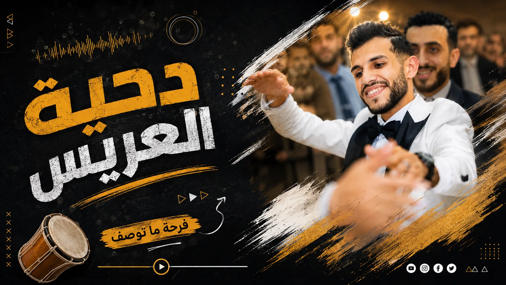
The event graphics place large Arabic headings beside portraits, festive imagery and gold-toned effects. Here the writing is a central part of the composition, not an afterthought layered on top at the end. Arabic lettering needs clear line spacing, sufficient size and contrast against bright background elements. Decorative type can work in short headings but often becomes harder to read in extended information.
Organizing festive details
Several designs include multiple photos, bright accents and motion-like decorative effects. These details contribute an energetic atmosphere but require breathing room around the heading and portrait. If every corner contains a high-contrast element, it becomes difficult to tell what to read first. Place the main title and image before filling remaining areas with supporting decoration.
Test every graphic on a phone
Type that appears perfectly readable on a large editing canvas can become illegible in a mobile card or story. Test the graphic at its actual display size: can the topic be understood in two seconds? Are important words readable? Does cropping cut off a portrait or heading? Keep a high-quality source, then export a display-sized copy with safe margins around essential text.